
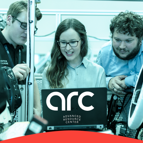
ARC - Mechatronic School Branding
- Libby Anderson

- Feb 11, 2022
- 1 min read
At the beginning of summer of 2021, I had the opportunity to work alongside LAB MPLS to create a brand identity for a new tech school being built in Warroad, MN.
The tech team needed everything from a name to signage design. I loved this project because it was a fun challenge and a little out of my comfort zone because Mechanics and Electronics are something I know very little to nothing about.
Mollie (LAB) and I took a deep dive into breaking down mechatronics, skimming the surface of what key takeaways of such a complex genre were to brainstorm the name. We stuck with strong, simple words that in a nutshell work together to connect and make things function. The list was long but we narrowed it down to two words we really felt hit the mark with creating community, connection, and being techy. Link and Arc were two words that were able to tell a story but overall, Arc felt the strongest and the most potential, everyone loved it!
I was excited about Arc because the word is so visual but also full of meaning for the school. Even the letters of the word have arches in them - a r c (!) For that reason, I felt keeping the name all lowercase would be powerful and visually appealing.
Now, my color comfort zone is usually deep, earthy neutrals but colorful. The client really wanted it to pop while working with the key color of Warroad which is a beautiful deep navy. We incorporated a hot red and a vibrant turquoise with the navy and all of a sudden, it all came together!


Comments